

In this post, we will dig and explore the basics of linear regression models as their essentials to predictive analysis. We will first analyze or examine the scatter plot and correlations that involves two quantitative variables. In addition, we will also examine the simple and multilinear regression models, and discuss predictions.
What you will learn
- Understanding the scatter plot and correlation.
- Basic understanding of the simple linear regression models.
- You should be able to use build multiple linear regression models.
- Know how predictions work with the use of regression models.
Linear regression attempts to model the relationship between two variables by fitting a linear equation to observed data. One variable is considered to be an explanatory variable, and the other is considered to be a dependent variable. For example, a modeler might want to relate the weights of individuals to their heights using a linear regression model (yale.edu, para 1).
A linear regression line has an equation of the form Y = a + bX, where X is the explanatory variable and Y is the dependent variable. The slope of the line is b, and a is the intercept (the value of y when x = 0) (yale.edu, para 3).

 | = | dependent variable |
 | = | function |
 | = | independent variable |
 | = | unknown parameters |
 | = | error terms |
This video will help you understand Error terms
Examining Scatter Plot and Correlation
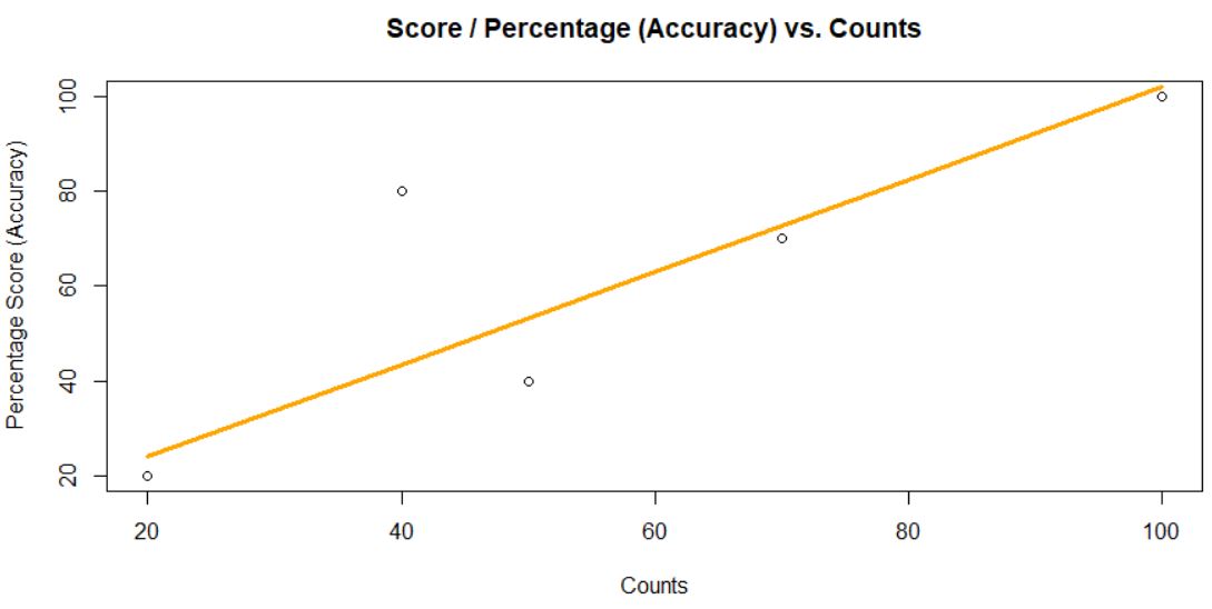
This scatters plot with a fitted linear regression line shows the relationship between Accuracy (Y)and Counts(X) (two quantitative variables) that has a positive relationship.
Determining correlation coefficient
In some cases we need to evaluate more than two variables, we can examine a scatter plot matrix like the example one below, I used rdrr.io website for Air Quality: New York Air Quality Measurements.
require(graphics)
 pairs(airquality, panel = panel.smooth, main = "airquality data")
While the focus in this is the linear relation through regress models, the relationship will not always be linear like the one in the scatter plot matrix. For example, the variables Wind and Day show a curvilinear relationship.
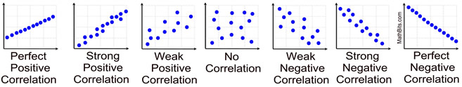
Source https://mathbitsnotebook.com/Algebra1/StatisticsReg/ST2CorrelationCoefficients.html
The correlation coefficient and denoted by r measures the linear association between the two variables. A perfectly linear relationship will always between -1 and 1. if no relationship If r is equal to zero(0).
So as a conclusion to this part 1, when you are dealing with scatter plots we only interested in the direction of positive and negative, and the strength of the relationship. In addition, if the two variables form a perfect linear relationship means that all data represent a straight line. As you can see In the example above of Wind and Day, the relationships don’t seem to be that strong. In order to quantify the direction and strength of the relationship, you should bring or introduce the correlation.
References:
Yale.edu(2021). Linear Regression. Retrieved from http://www.stat.yale.edu/Courses/1997-98/101/linreg.htm
Khan Academy (Nov. 15, 2010). The squared error of regression line. Retrieved from https://www.youtube.com/watch?v=6OvhLPS7rj4


Nice. Thanks for this blog Harry.
You’re welcome Ronie!